PŘÍPADOVÁ STUDIE
How do you show that a bathroom can be an experience before you even turn on the tap?
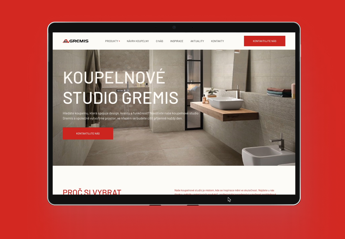
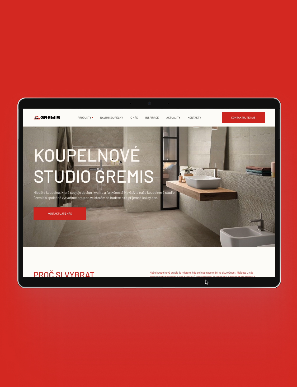
The brief was clear: find a new direction for a brand that knows what good material is, but needed customers to know it too.
We went at it from the floor up.
A clear website structure.
Content that doesn't sell products, it sells solutions.
Copy that speaks like a human. Even after three hours of choosing tiles.
We rethought everything: from the selection process to the microcopy on a button. And we added a dash of style that brings the showroom to life online too.
A bathroom? It's not just tile and a shower. It's emotion. Flow. And when it works right, no one notices. It just fits.
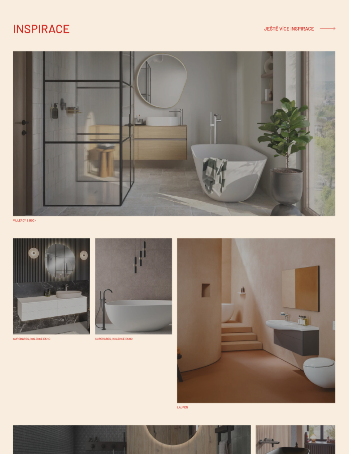
See how we helped turn a store into a tool that pulls in even the person who just came to "browse the catalog."
Target audience
We analyzed the needs, expectations, and behavior of customers so we could target content and design precisely.
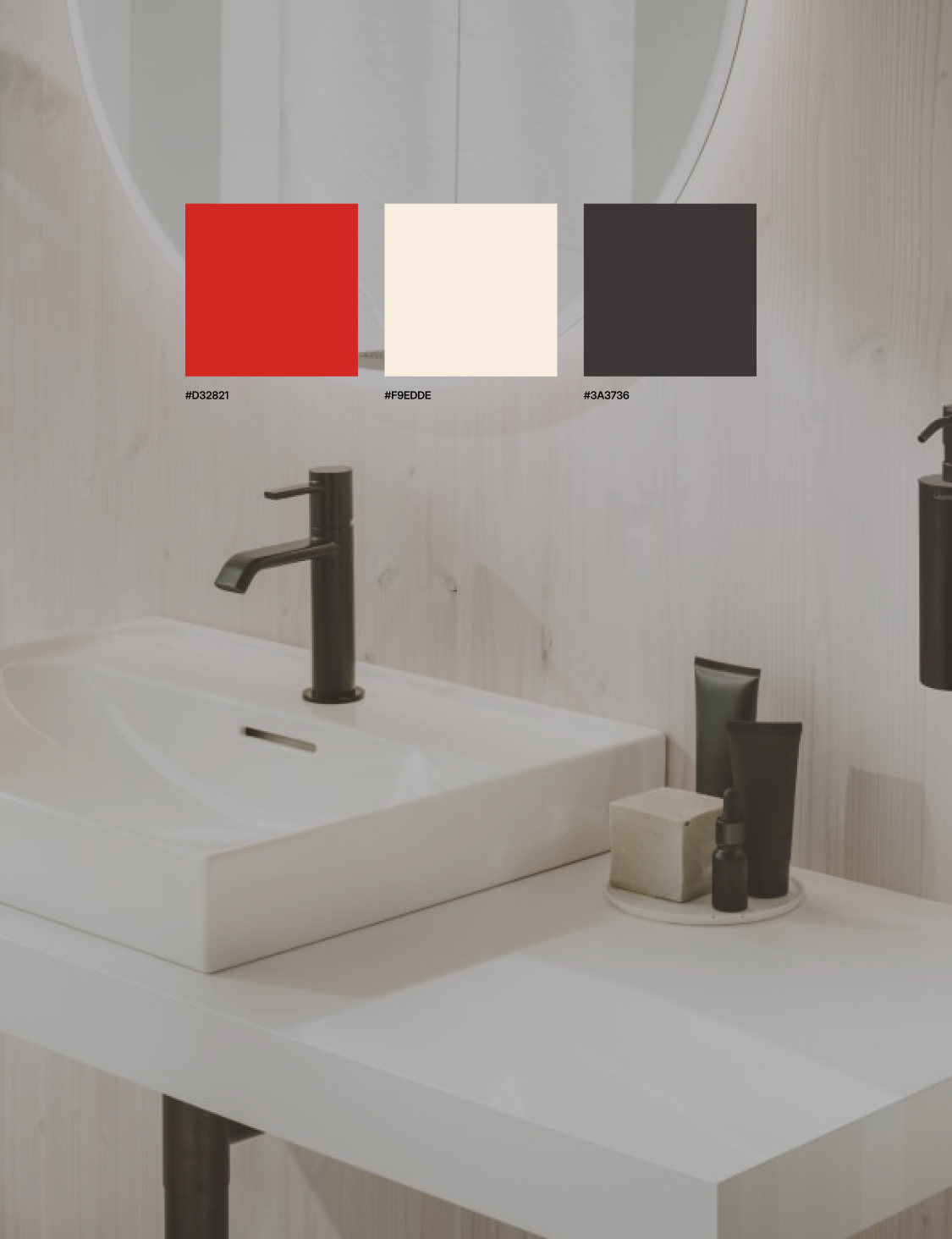
Moodboard and visual direction
We designed a visual style that defines the overall brand expression and stays flexible enough to use across other Gremis partner websites.
Graphic design
UI design for every page, with an emphasis on clarity, aesthetics, and strategic reusability for future projects.
Responsive design
We ensured flawless performance across every device, from phone to desktop.
Design system
We built a scalable system of components, styles, and rules for quickly creating more websites in a unified visual spirit.
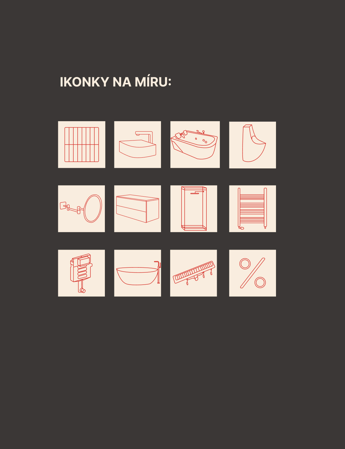
Custom icons
We created a set of original icons tailored to the visual identity of the bathroom segment.
Educational videos for Webflow
We recorded short tutorials so the client can handle basic website edits without needing a developer.