PŘÍPADOVÁ STUDIE
It was clear that SIMPLY had a lot to offer: savings, stability, clarity. But the old website didn't say it clearly or simply. Today's users expect simplicity, trust, and quick orientation. The original pages were too technical and didn't lead anyone to action.
We built a new website that speaks the language of today and of today's customers:
Choosing an energy supplier isn't just a technical decision. It's a question of trust and comfort. And when everything works, there's no need to ask. It all just fits together.
Competitor Analysis
We went through the websites of the main players on the market to see what really works and to find room for Simply to stand out.
Understanding users
We focused on the needs of today's customers. The ones who want clear information, easy decisions, and a modern online approach.
Structure and user flow
We built a layout that leads users through the site naturally, from first impression to form submission.
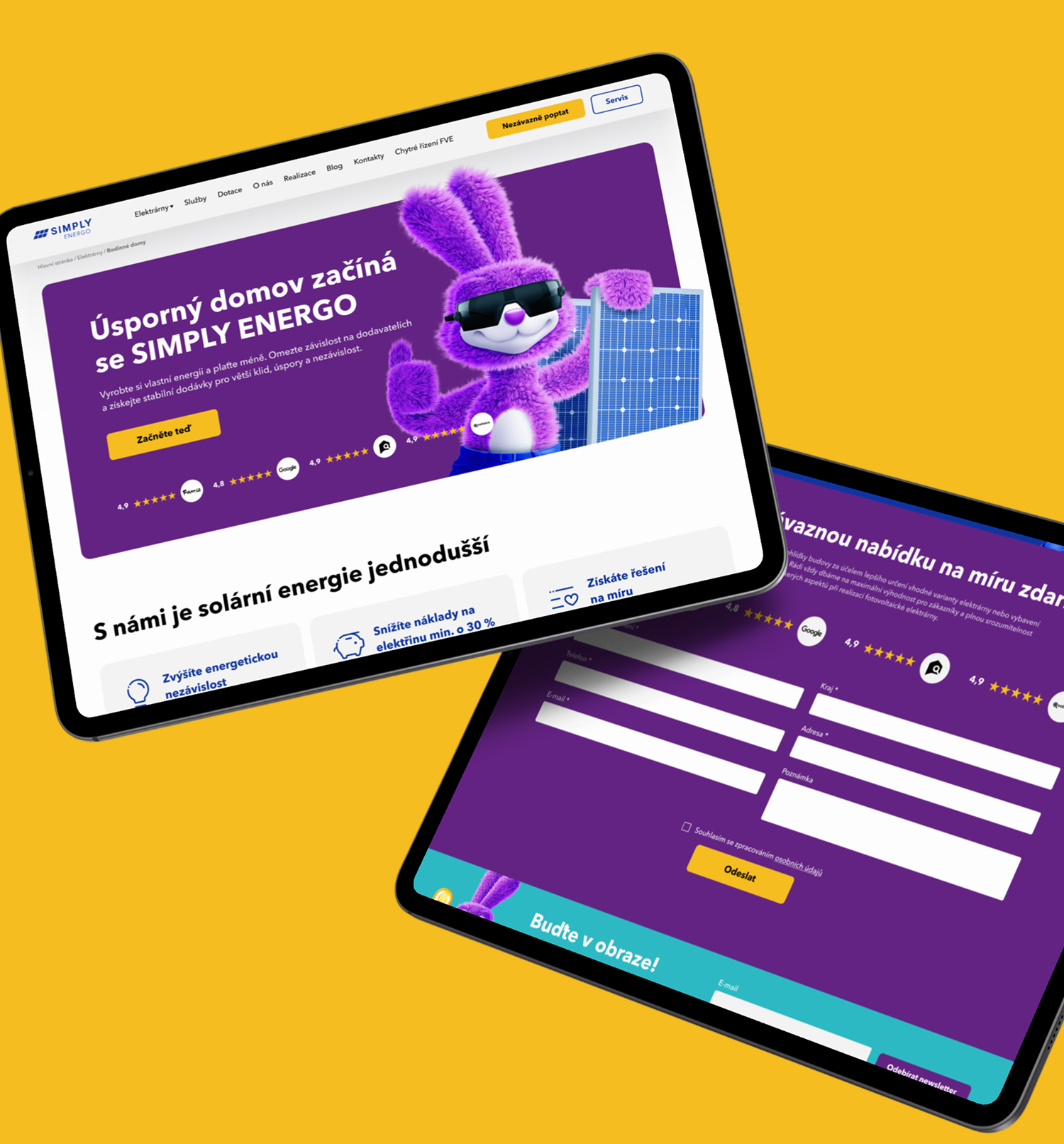
Visual direction and style
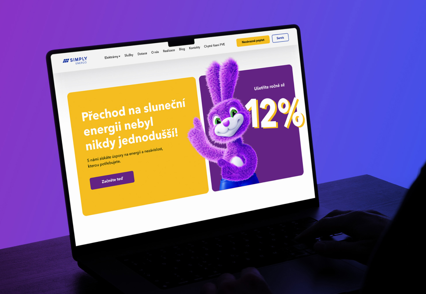
We designed the brand style from the ground up: new colors, typography, and use of space. All unified and modern.
Custom UI design
Every page was designed to be clear, attractive, and fully functional.
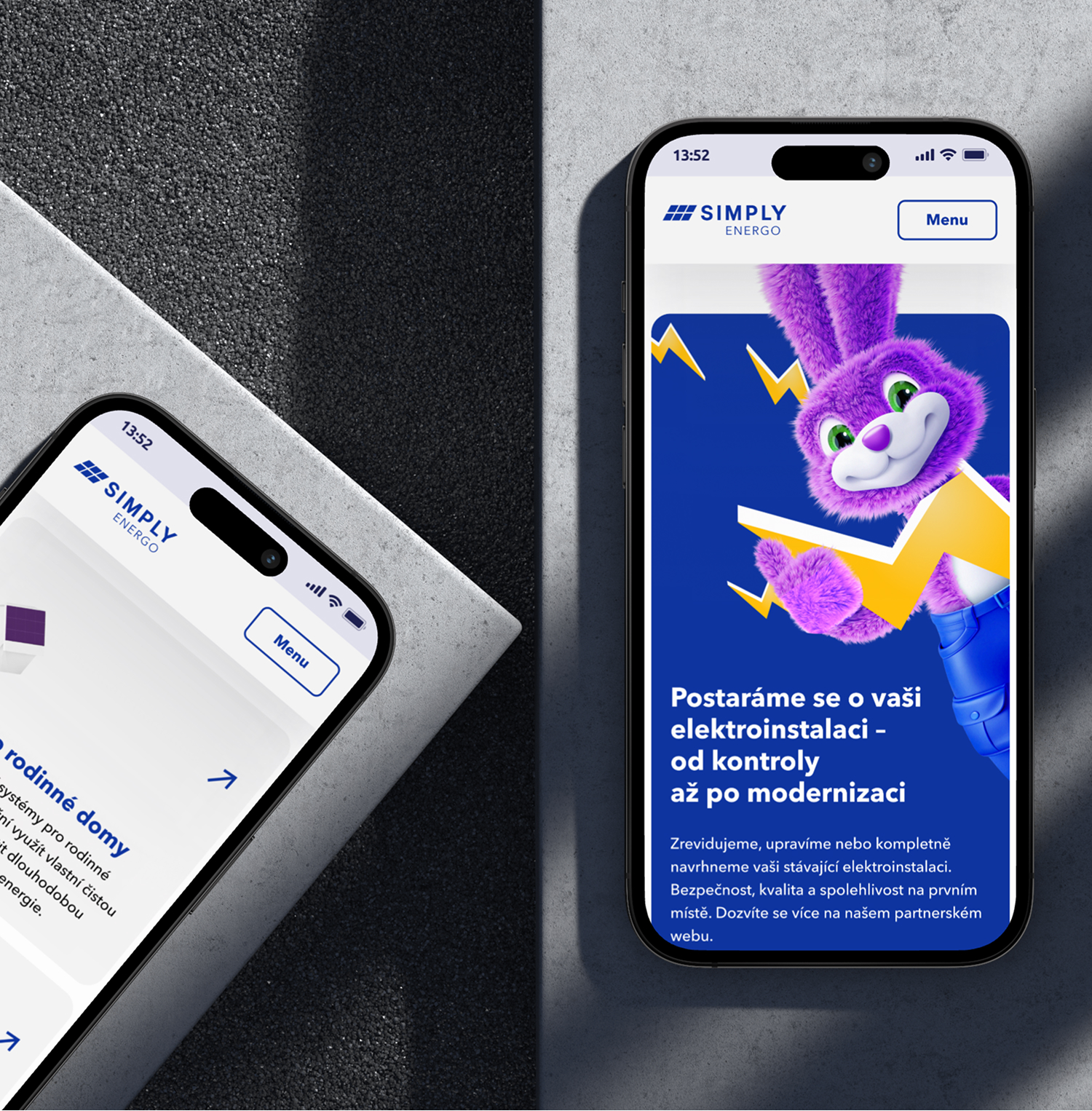
Full responsiveness
The website works reliably on every device, from phone to large screen.
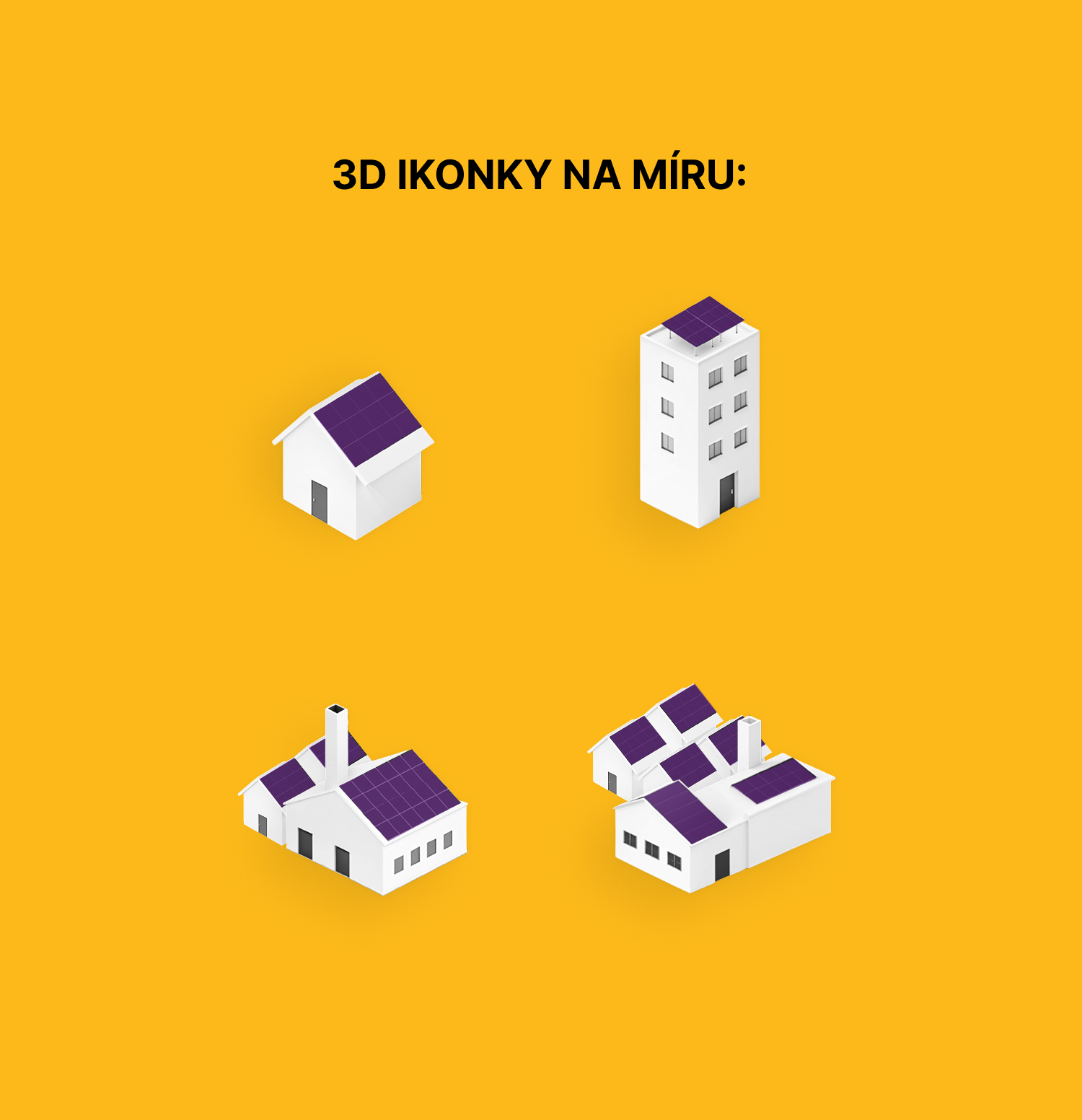
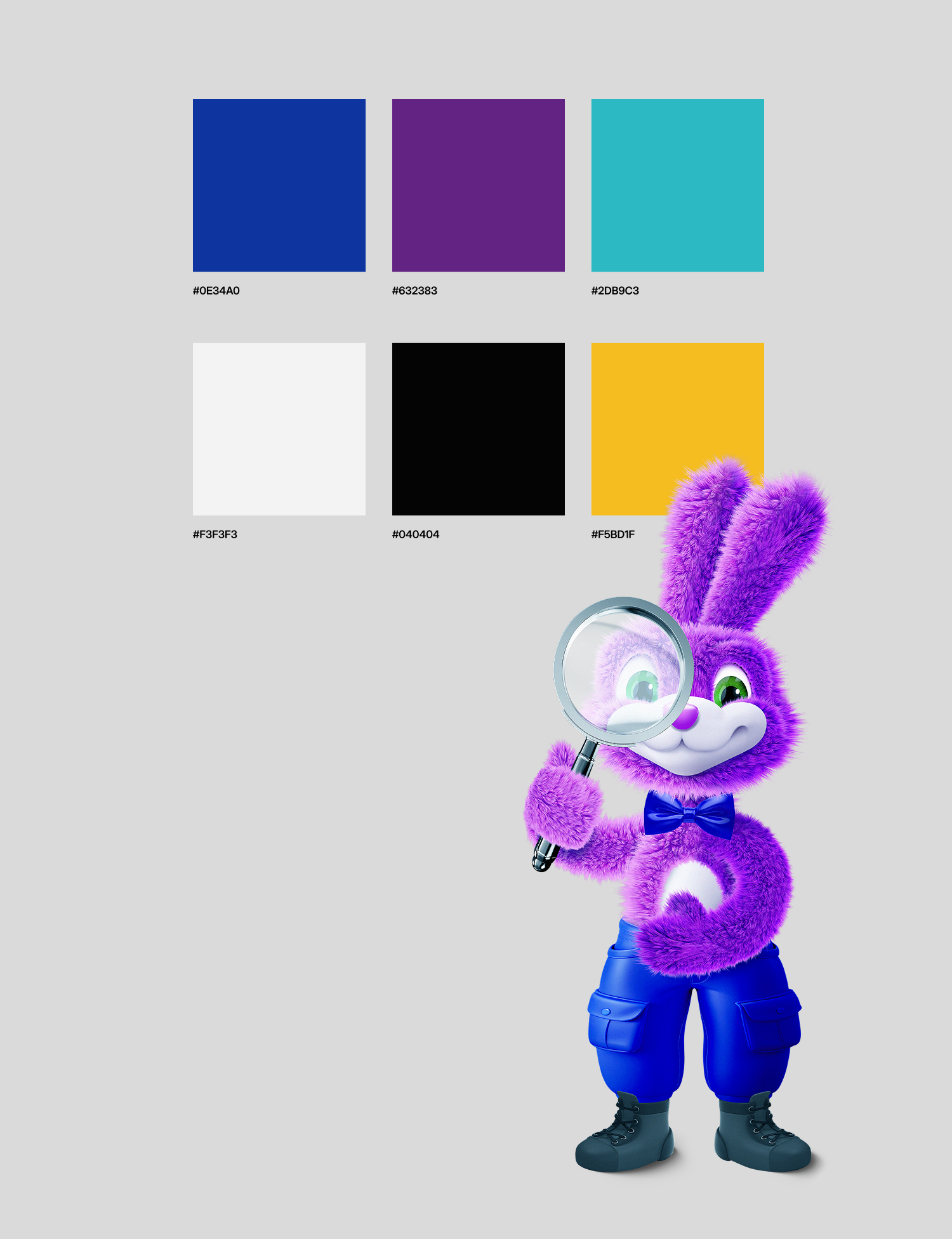
3D elements
We created a set of original 3D icons and visuals that complement the brand and clarify more complex energy information.